
Case study · Social Media
Velora
Beauty & Skincare · Social Media Design
Hover to pause · Drag · Click center to preview
Skincare is saturated with sameness. Velora needed a feed that felt warm, clinical, and quietly premium all at once.
The brief
Beauty is one of the most crowded categories on social, full of the same soft-focus pastels and the same claims. Velora needed a feed that stood apart by feeling intelligent: warm, clinical, and premium, a brand that respects the person reading it.
The direction
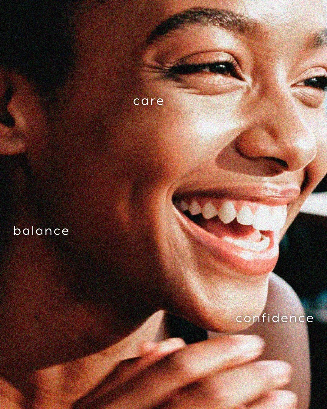
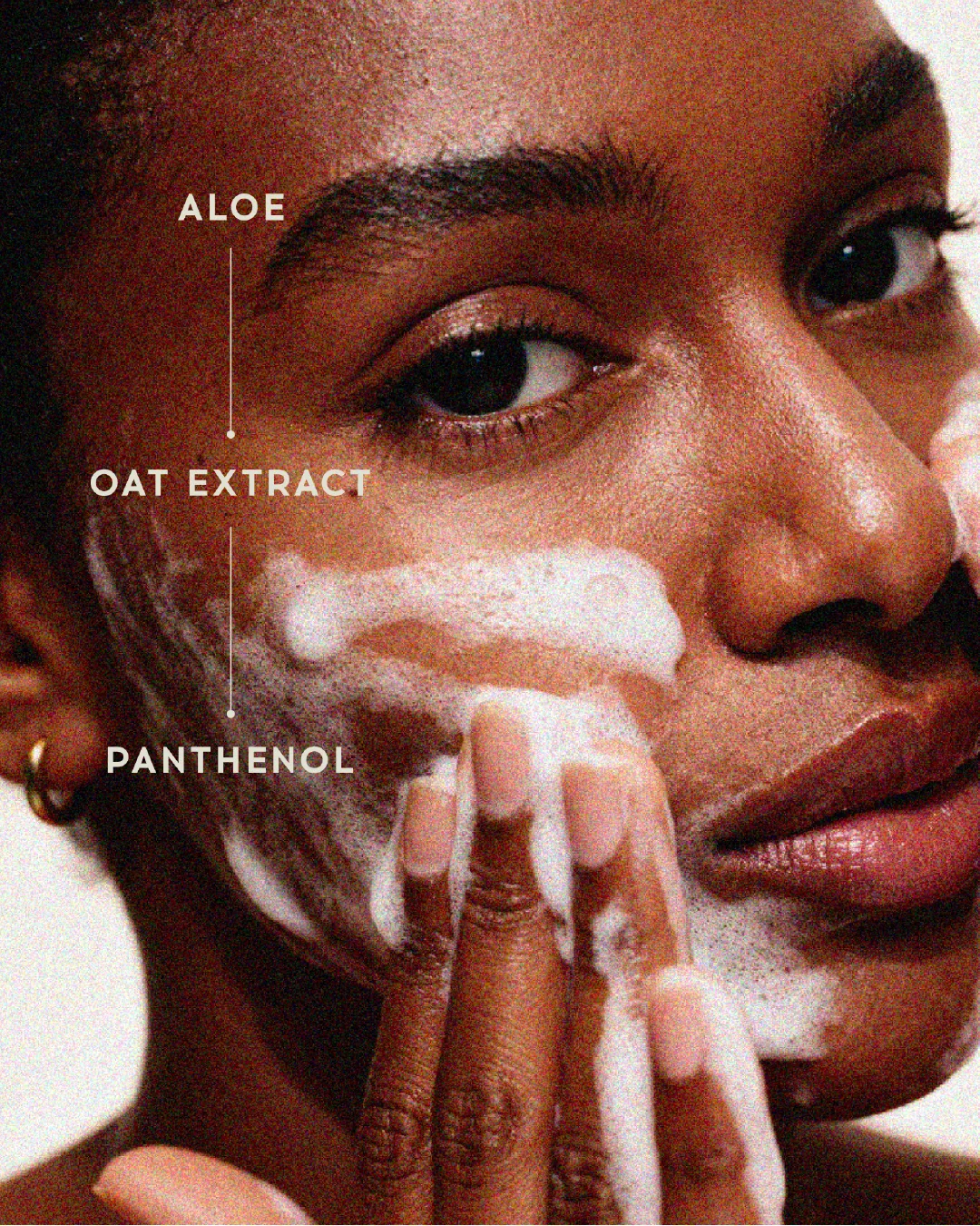
We built a warm neutral palette, editorial skin-close photography, and thoughtful lines that position Velora as care with substance. The look is soft but never generic, clinical but never cold.
Why it works
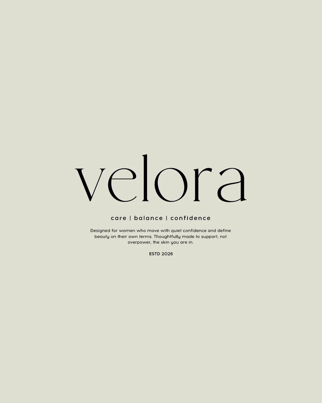
In beauty, a distinct, intelligent point of view cuts through a sea of sameness. Consistent editorial styling and copy that treats the audience as smart build a brand that feels premium and trustworthy, which is what turns a skincare scroll into a follow. Substance is the differentiator.
The point
The grid feels like one considered brand rather than a product catalog. In a category this saturated, a clear point of view is what makes Velora impossible to scroll past.
Grid curation
Beauty and skincare social is brutally saturated, and most of it blends into the same pastel, soft-focus wash. The brands that break through have a distinct, intelligent point of view: a consistent editorial aesthetic, a real tone, and copy that respects the reader. Generic prettiness and empty claims disappear in the feed, because the audience has seen it a thousand times.
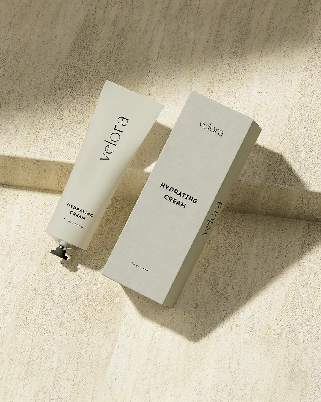
So we curated Velora's grid to feel warm, clinical, and quietly premium. A narrow warm-neutral palette, editorial skin-close photography, and thoughtful lines run across the feed, alternating model, product, and idea. Unified by tone and palette, the grid reads as one considered brand with substance, which is exactly what makes it stand out in a category built on sameness.
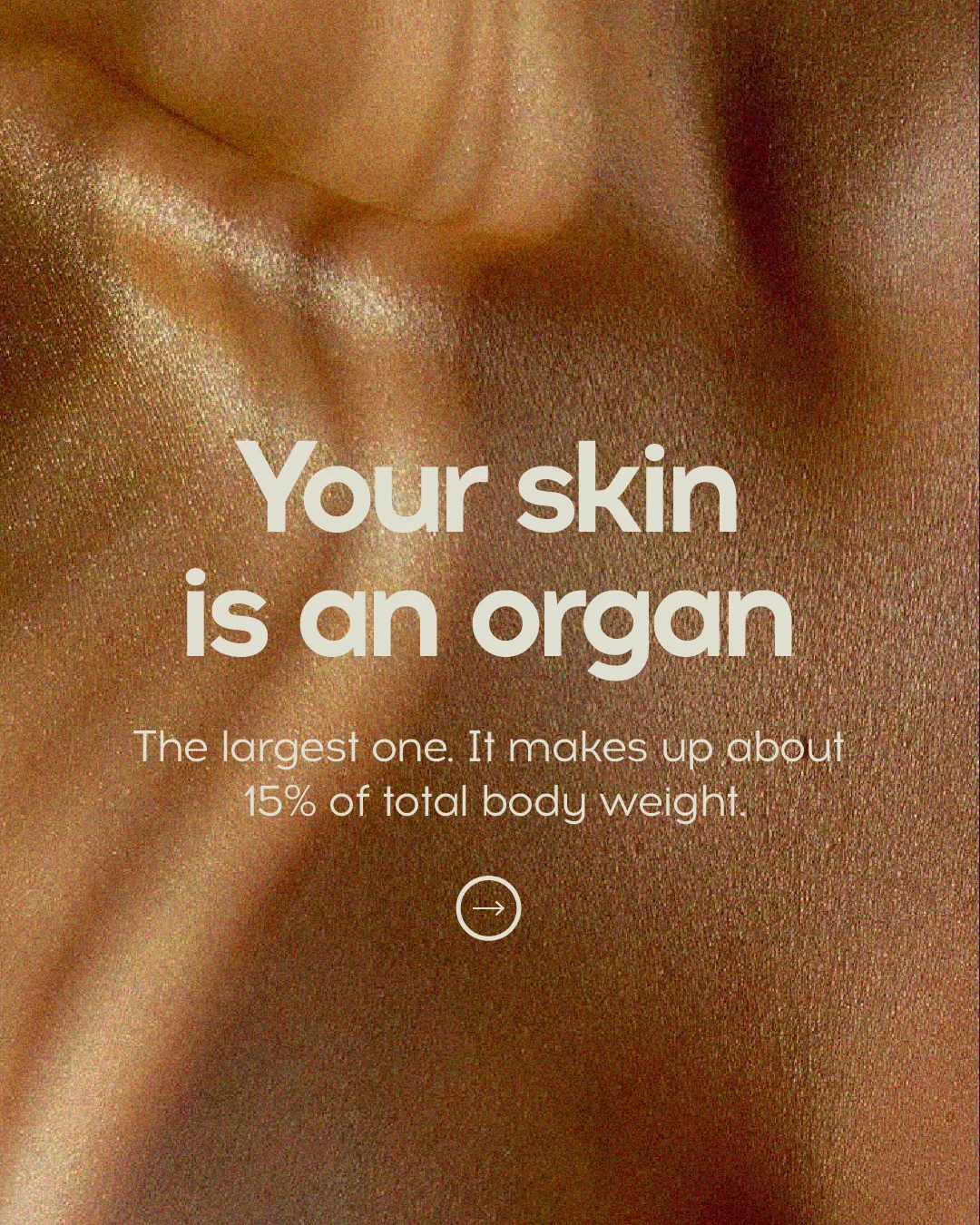
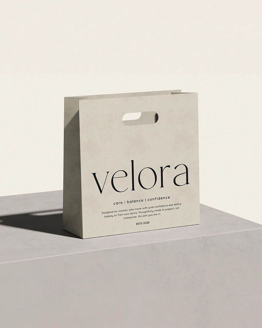
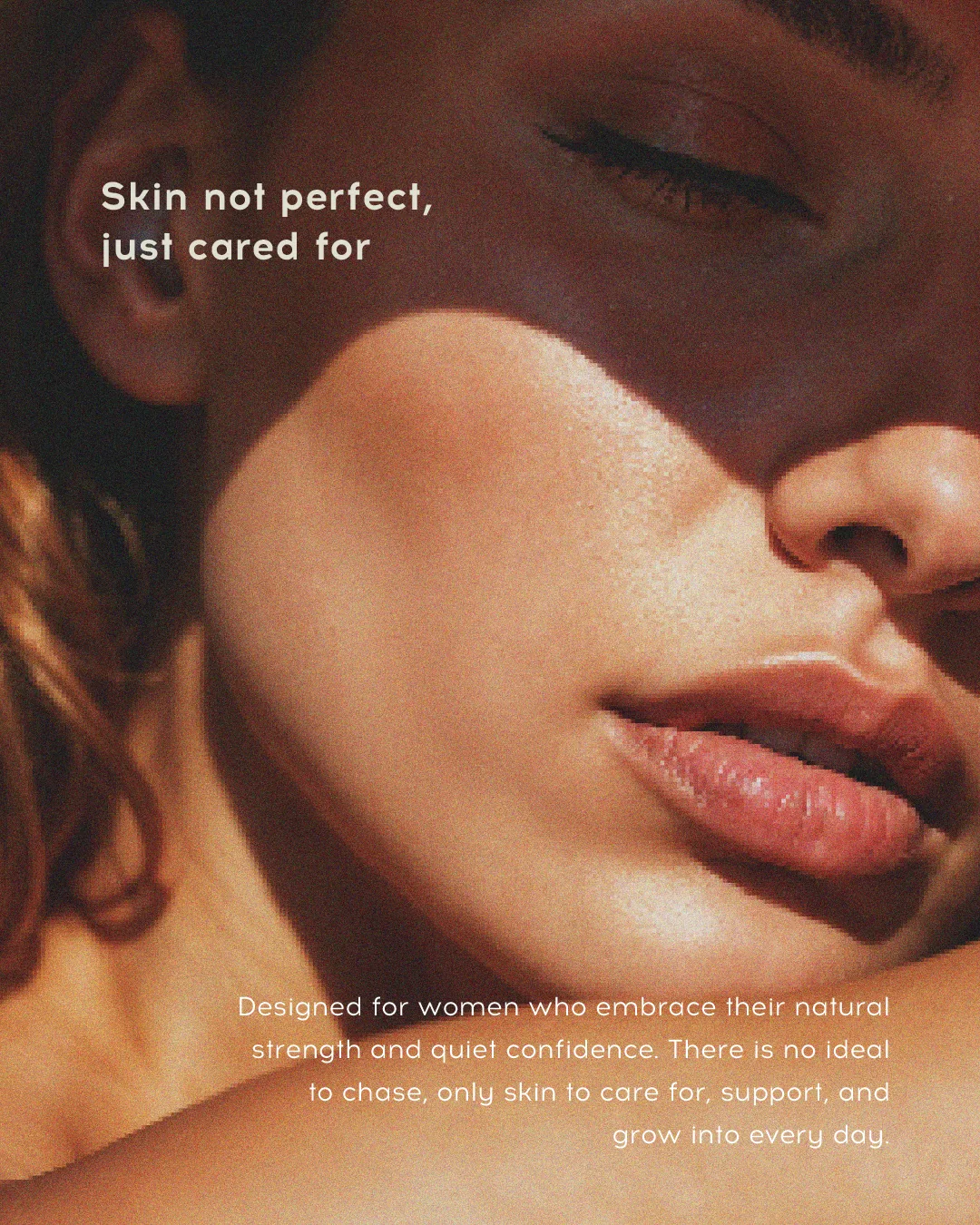
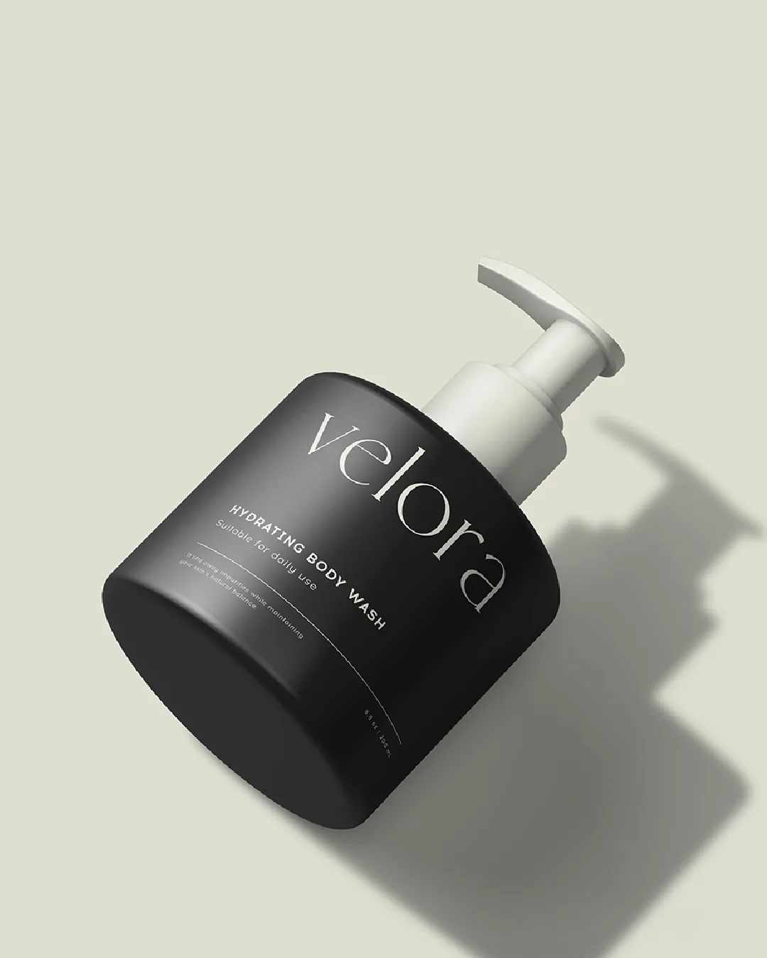

The grid, seen whole. Land on any point and the brand places instantly, before a caption is read.
Client
Velora
Sector
Beauty & Skincare
Services
Social Media Design
Year
2026
Next project
WebAge ↗