
Case study · Social Media
Lil Brew
Food & Drink · Social Media Design
Hover to pause · Drag · Click center to preview
Coffee is a crowded, sensory category. Lil Brew needed a feed with a personality people actually remember.
The brief
Every specialty coffee brand photographs a flat white eventually. The product is not the differentiator. The feeling is. Lil Brew needed a feed that felt like a place with a personality, not another cafe posting latte art.
The direction
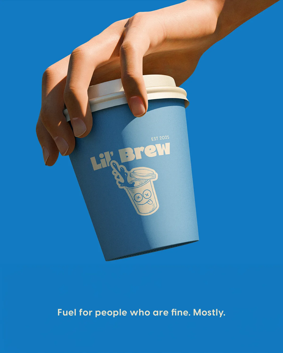
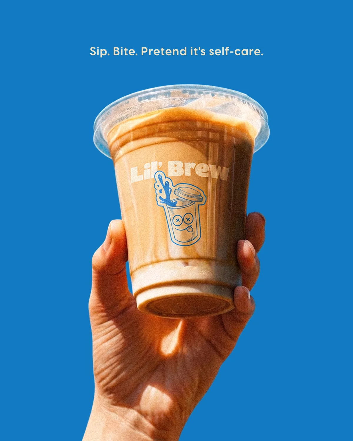
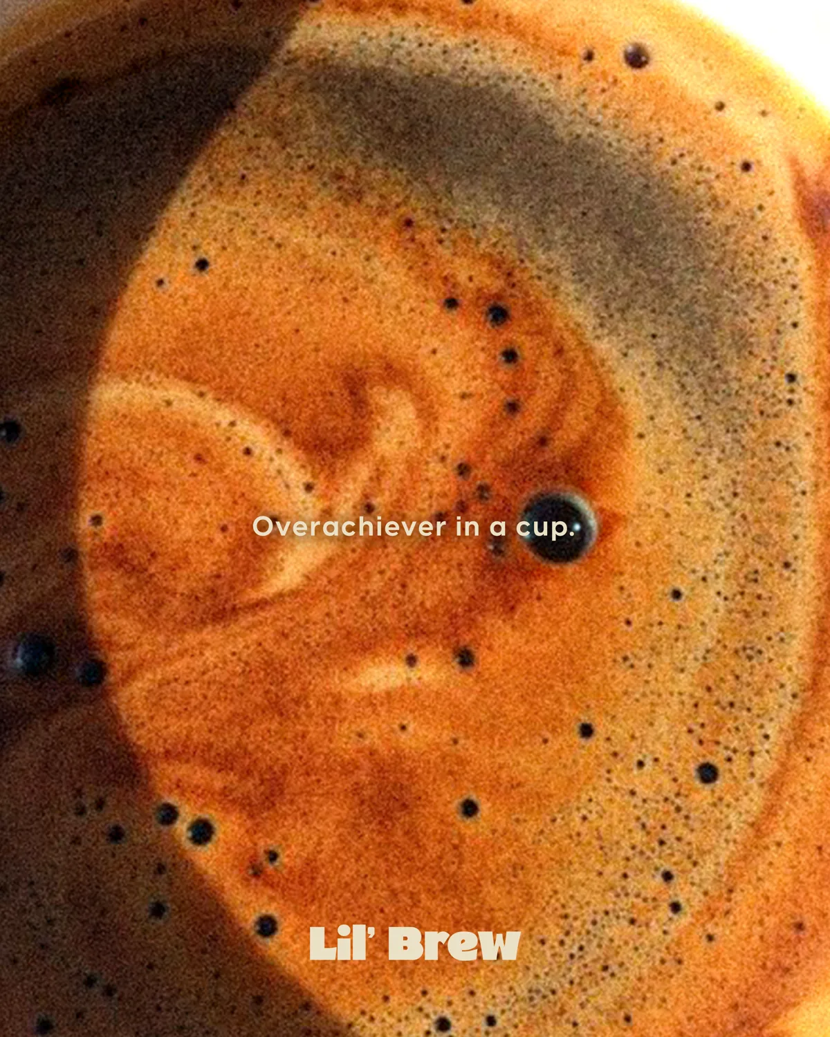
We committed all the way to a single ownable blue, playful product photography, and copy with a wink. Warm, human, a little cheeky, never corporate. The blue does the recognizing before the logo ever loads.
Why it works
In food and drink, distinctiveness beats polish. A brand that owns one color and one tone of voice gets remembered in a scroll full of beige coffee shops. Consistency across product, mascot, and storefront turns a cafe into a brand people quote.
The point
Lil Brew stopped looking like every other coffee account and started looking like Lil Brew. That recognition is the whole game in a category this crowded.
Grid curation
Specialty coffee is one of the most saturated categories on social, and most of it looks the same: warm tones, latte art, minimal captions. The brands that break through do it with a strong ownable color, a real voice, and product shots with personality. Blending in is the actual risk. Playing it safe reads as forgettable.
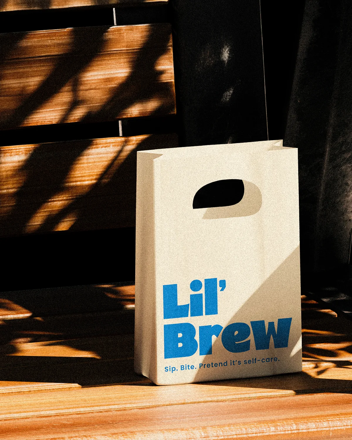
So we curated Lil Brew's grid around one vivid blue and a light, witty tone that runs through every post. Product, mascot, and storefront rotate through, but the color and voice never change, so the feed is recognizable at a glance. The grid does not try to look premium. It tries to look like Lil Brew, and that is what people remember.
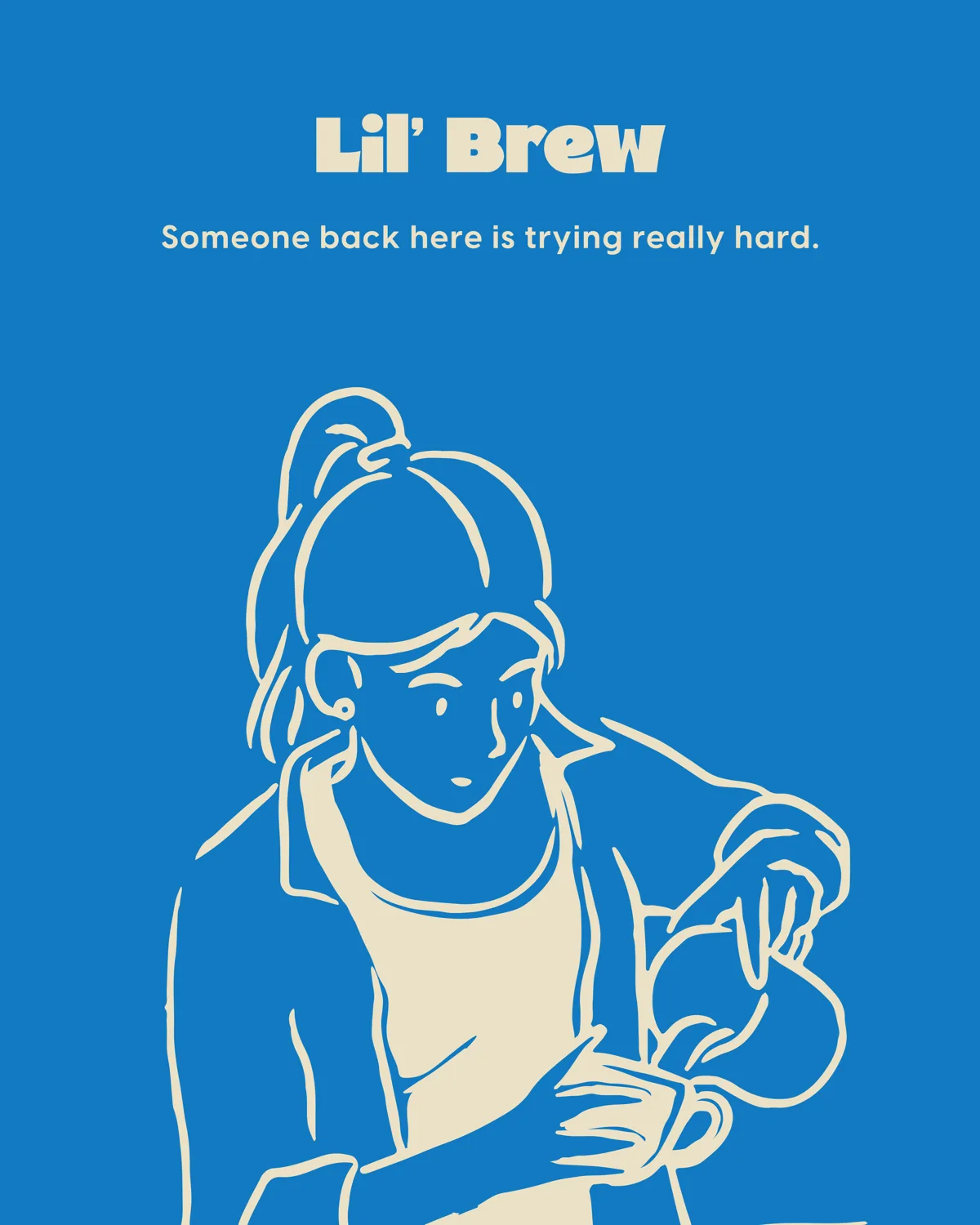
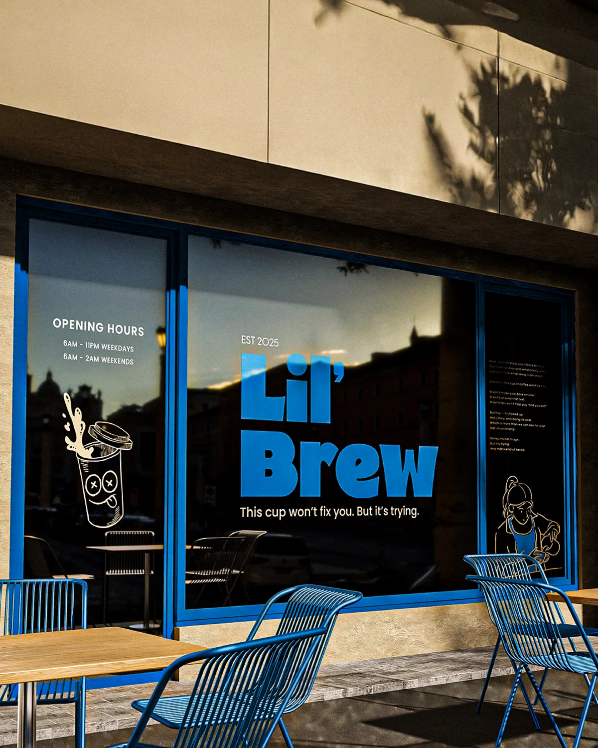
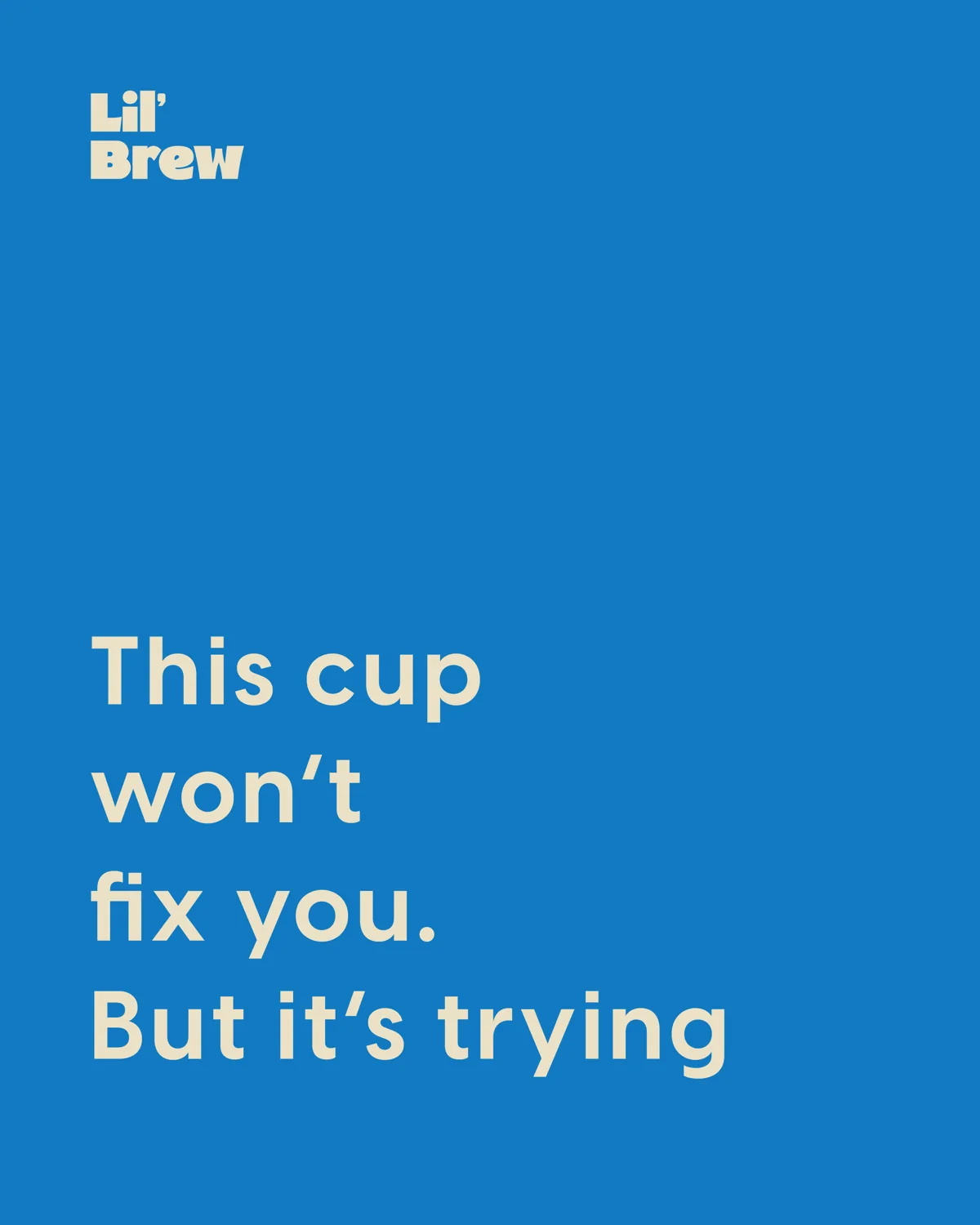
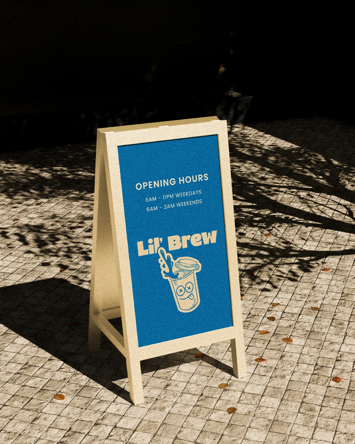
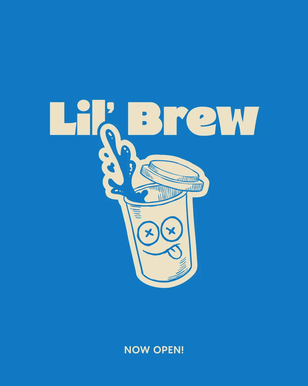
The grid, seen whole. Land on any point and the brand places instantly, before a caption is read.
Client
Lil Brew
Sector
Food & Drink
Services
Social Media Design
Year
2026
Next project
Ouvre ↗