
Case study · Social Media
Dentist
Healthcare · Social Media Design
Hover to pause · Drag · Click center to preview
Dental content usually reads clinical and cold. The feed had to feel reassuring, closer to care than to procedure.
The brief
People do not follow a dentist for fun. Healthcare content has to overcome a little fear and a lot of coldness before it can do anything else. The feed needed to feel warm, human, and trustworthy, so booking feels like a relief, not a risk.

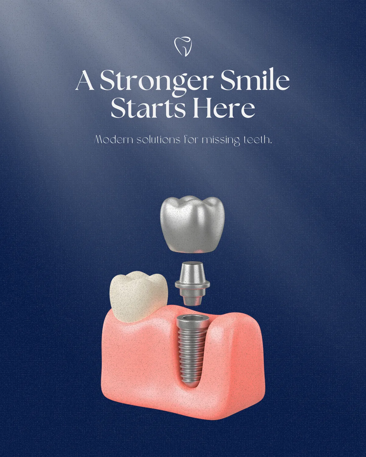
The direction
We built the feed on a soft palette, real smiles, and calm, plain-language headlines. Clean visuals keep it credible without going sterile. Every post leads with reassurance and lands on one clear message.
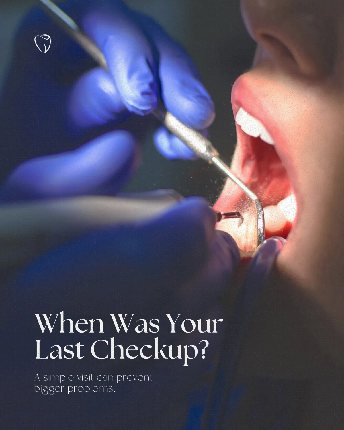
Why it works
In healthcare, trust is the entire funnel. Warm, consistent, jargon-free content signals a practice that treats people well, which is exactly what a nervous patient is scanning for. The look does the reassuring before a single word is read.
The point
The feed feels like a practice you would trust rather than a clinic you would dread. For a category built on hesitation, that feeling is the conversion.
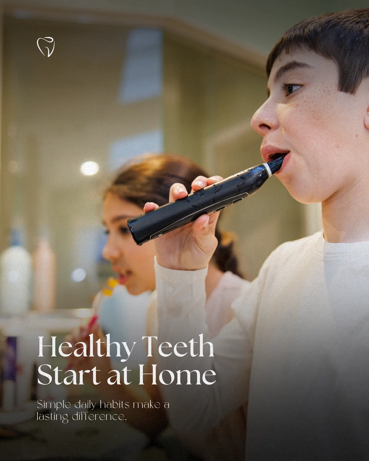
Grid curation
Healthcare and dental social carries a built-in problem: the category is associated with anxiety and cold, clinical imagery. The accounts that work do the opposite. They lead with warmth, real people, and plain language, and they use a soft, consistent palette that signals care over procedure. Sterile stock imagery and jargon push nervous patients away.
So we curated the feed to feel like reassurance. Warm tones, genuine smiles, and simple, calm headlines run across every post, balanced with credible clean design. Land anywhere on the grid and it reads as a practice that will treat you gently, which for a hesitant patient is the whole reason to book.
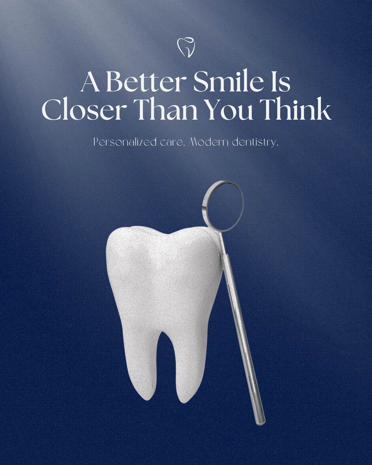
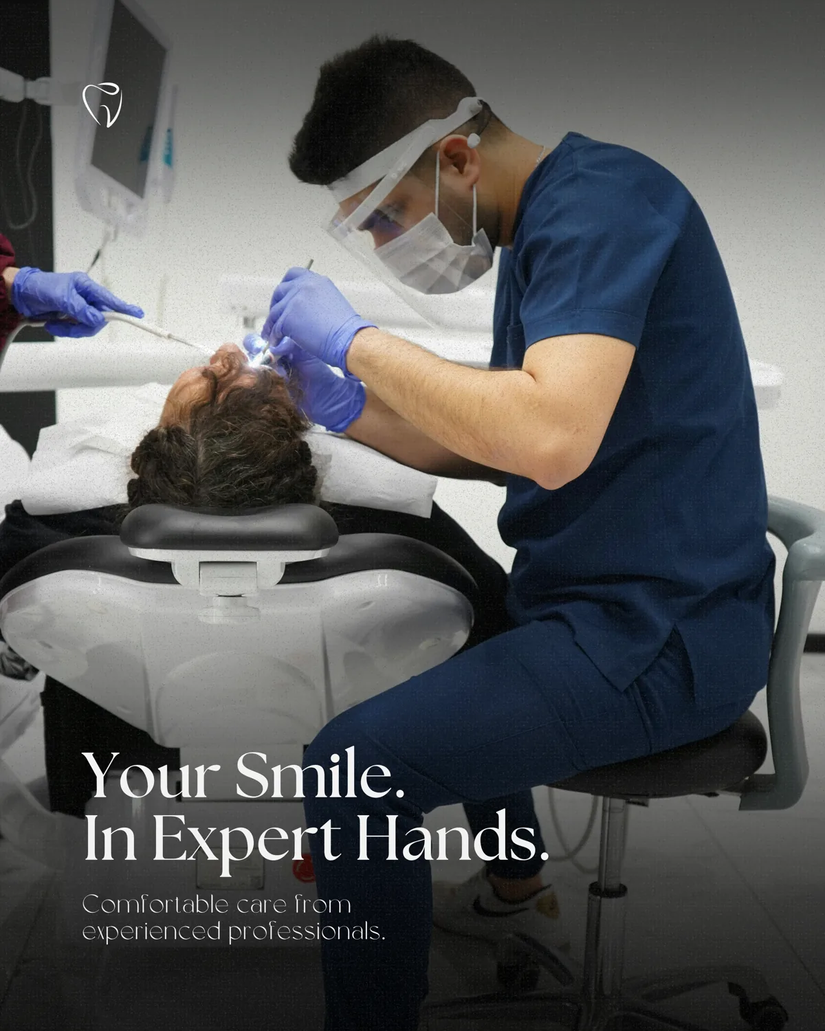
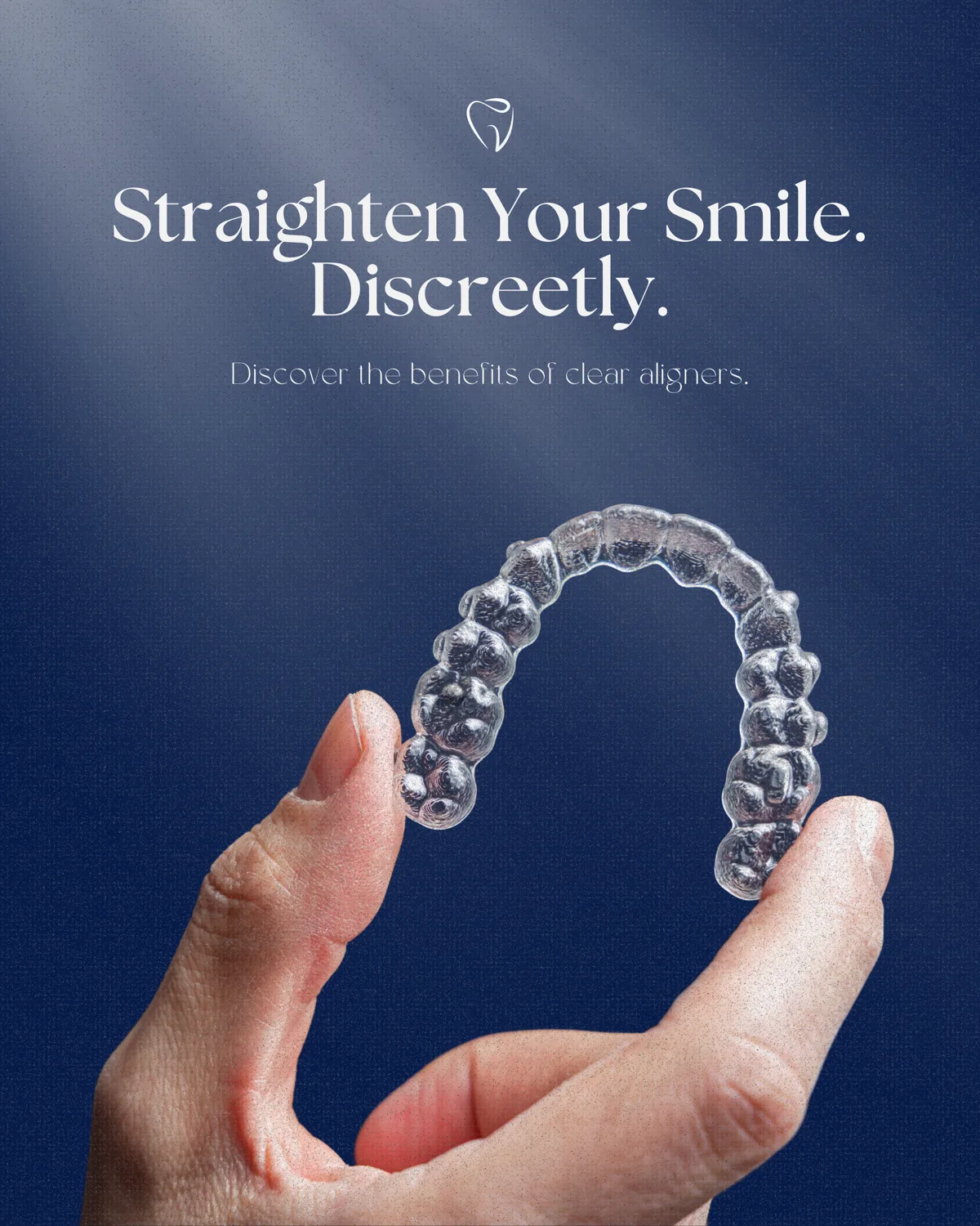

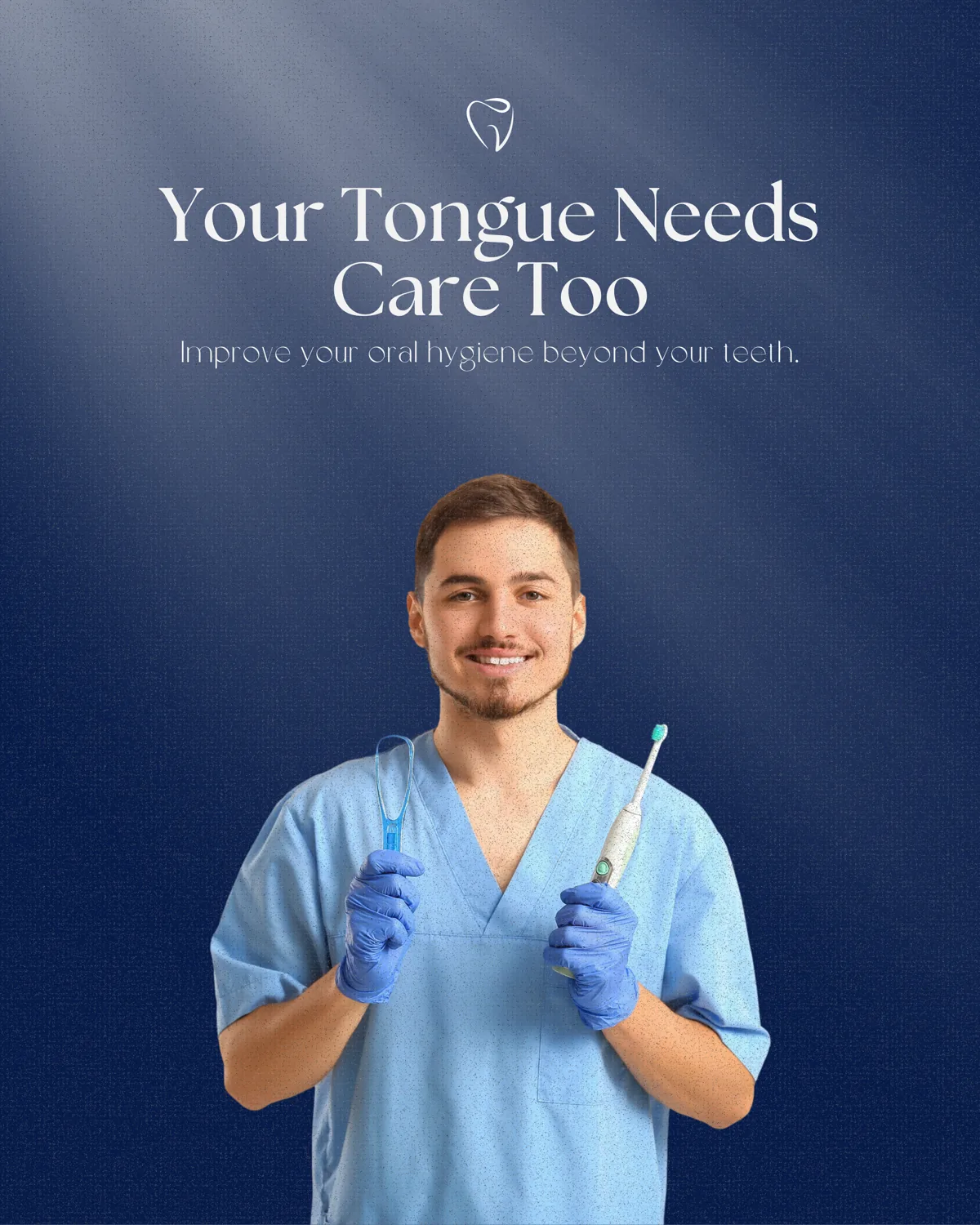
The grid, seen whole. Land on any point and the brand places instantly, before a caption is read.
Client
Dentist
Sector
Healthcare
Services
Social Media Design
Year
2026
Next project
DevPro ↗